
QuickLinks#
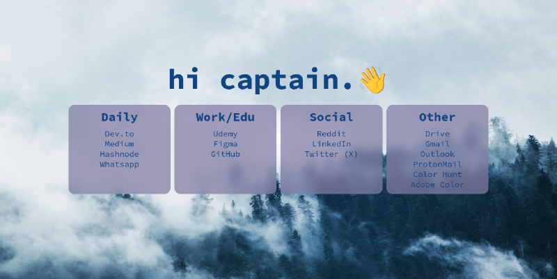
QuickLinks is a simple browser start page that allows you to quickly access your frequently used websites. It is built using HTML and CSS. The project enables users to organize and customize their links.
Demo#
You can check out a live demo of QuickLinks here: QuickLinks Demo.
Features#
- Quick Access: Access your frequently used websites with a single click.
- User-Friendly Interface: A clean and intuitive design.
- Customizable: You can add and organize your own links.
Technologies#
- HTML
- CSS
Installation#
Clone this repository:
git clone https://github.com/kuscadev/QuickLinks.gitCustomize the start page in your browser settings and set the link to the
index.htmlfile location.
Customization#
There are two main sections that you can customize:
🎨 Theme Customization: QuickLinks supports theme switching and visual customization using CSS variables and the
data-themeattribute.🔄 Switching Themes
You can change the theme by adding the
data-themeattribute to the<html>tag: Example:<html data-theme="dracula">Available themes:
- default
- dracula
- rose-pine-moon
- catppuccin
🎯 Customizing Colors and Fonts
Each theme uses scoped CSS variables. You can override these variables to adjust colors, fonts, or spacing.
Example:
[data-theme="dracula"] {
--bg-color: #282a36;
--text-color: #f8f8f2;
--primary-color: #bd93f9;
}

[data-theme="catppuccin"] {
--bg-color: #1e1e2e;
--text-color: #cdd6f4;
--primary-color: #f5e0dc;
}
🛠 Modifying the Default Theme
If you want to tweak the default theme, update the variables under
[data-theme="default"]:[data-theme="default"] { --bg-color: #232136; --text-color: #e0def4; --primary-color: #f6c177; /* Customize as needed */ }🌐 Global Variables (:root) Variables declared under
:rootare shared across all themes. These typically include:- Font size
- Border radius
- Box shadow
Example:
:root {
 --font-size: 20px;
 --heading-size: 70px;
 --mobile-heading-size: 50px;
 --box-border-radius: 15px;
 --box-shadow: 4px 4px 10px #232136;
}
Use these variables to define global layout styles that remain consistent regardless of the selected theme.
✅ Note: Theme-specific colors should be set under
[data-theme="..."], while cross-theme styling should be placed under:root.Links: Although the default links are useful for daily use, you can add your own links and remove any unnecessary ones by modifying the
index.htmlfile.
Upcoming Features#
- Dark/Light Theme Support: A toggle feature to switch between dark and light themes for a personalized visual experience.
- Link Management: An interface where users can dynamically add, edit, and organize their links.
- Date and Time Display: A section that shows the current time and date at the top of the page.
- Search Bar: A feature that allows users to quickly search for specific links within the page.
License#
This project is licensed under the MIT License - see the LICENSE file for details.